
Best Way to Control Divi Column Stacking Order
Have you built a two column layout in Divi, only to find that the column stacking order on mobile is not what you wanted?
The Divi WordPress theme creates responsive web pages automatically seamlessly transitioning between desktop, tablet, and mobile. A row with two columns show up side by side in desktop view, and will stack left column over right column in mobile view. But what if you want that order reversed? How to flip column order for mobile in Divi?
A common design element is to use a two column row to display an image on one side and text on the other. When followed by another two column row, it often looks better to alternate the positions of the image column.
In this example from the Divi Layouts Library, the first row has an image in the right column, and the second row and an image in the left column:
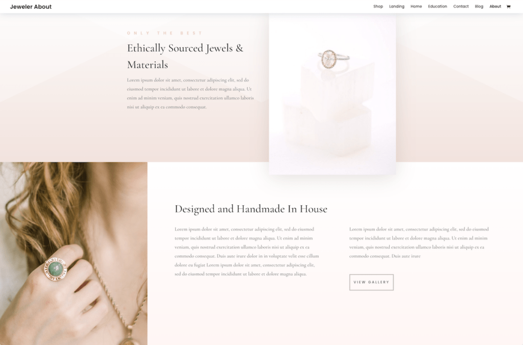
This looks great on desktop view, but when viewed in mobile view, the images get stacked on each other. Not ideal.
What we want to do is to override the Divi column stacking order on mobile and place them in reverse order. We want the right column on top of the left column.
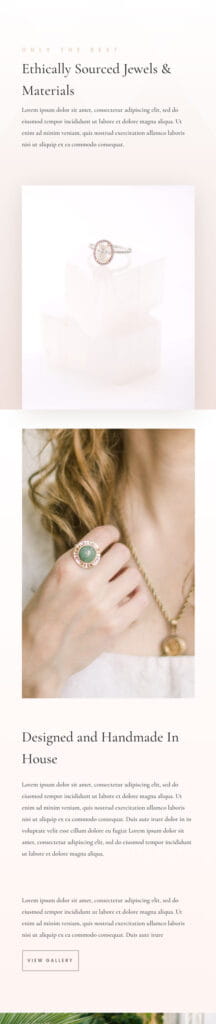
Divi Column Stacking Default Order
By default the left column stacks first, which looks unbalanced in mobile view. The two images stack on each other.
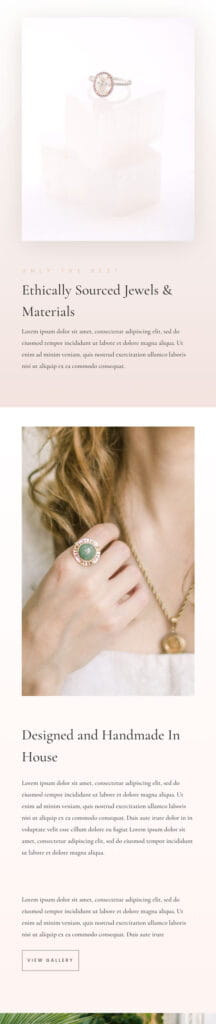
Divi Column Stacking Reverse Order
Reversing the order puts the right column image first, for a nicely balanced, alternating image and text design.
Changing Divi Column Stacking Order on Mobile
We will show two ways to reverse the Divi column stacking order. The first method is to have the CSS code stored globally to simplify the task if you have multiple rows that need to be fixed. The second method is just for a one off.
Reverse Divi Columns, Global Method
The best way to change stacking order is to use CSS. Apply this at the Divi Row Module level for the affected columns. Within the Divi Visual Builder, click the Row Settings icon.
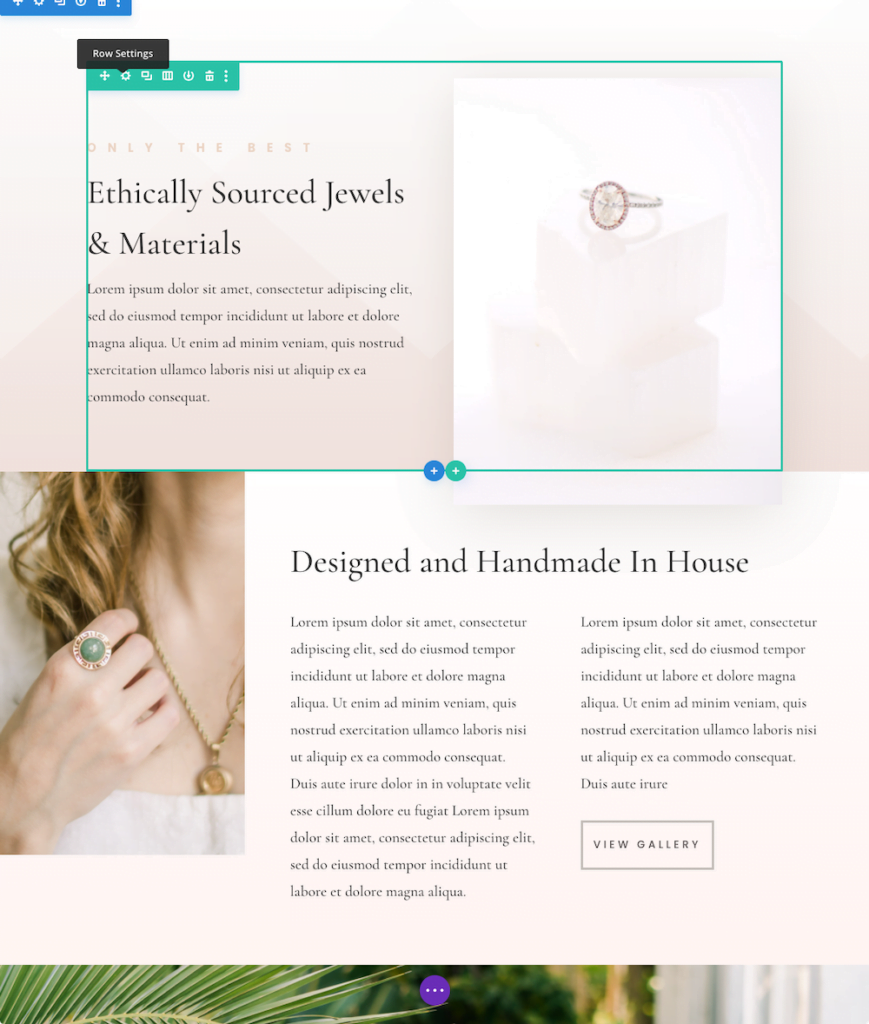
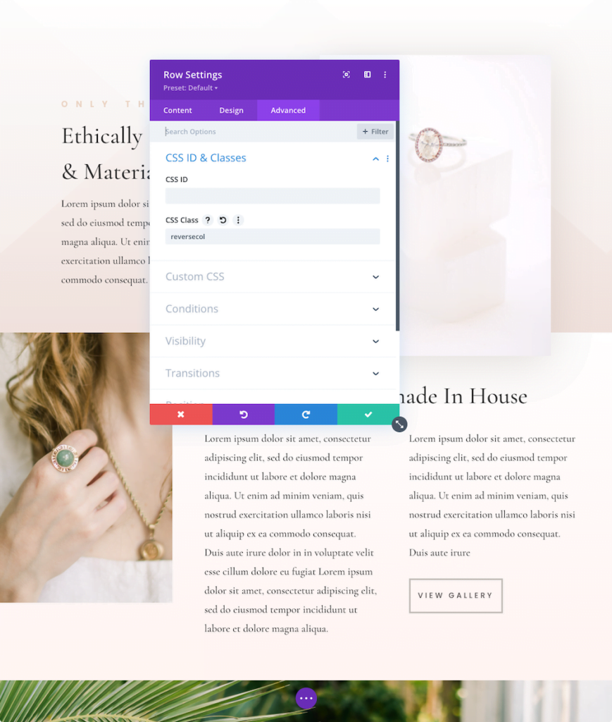
Once you get to the Divi Row Settings, click on the ADVANCED tab.
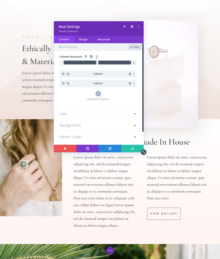
Once on the Advanced Tab, look for CSS Class and type in: reversecol
This adds a CSS class specification for this row.
After typing in the CSS Class name, click the Green checkmark to save this setting, and save the page.
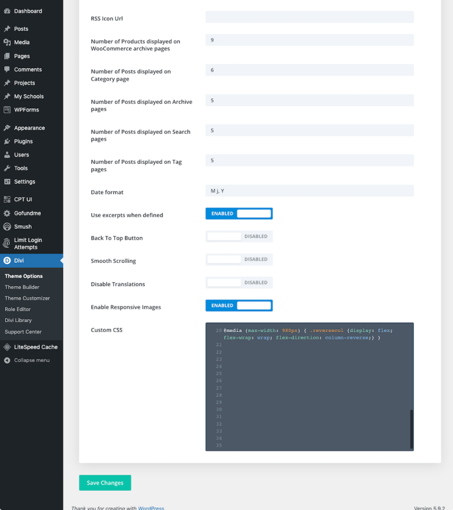
Finally, put the CSS code under the main web site navigation: Divi > Theme Options.
Enter the following (copy and paste) into the Custom CSS field:
@media (max-width: 980px) { .reversecol {display: flex; flex-wrap: wrap; flex-direction: column-reverse;} }Then click the green Save Changes
That’s it! Now your columns will stack in reverse order for the specified row.
The benefit of putting the CSS code in the global Divi Theme Options is that it is available on all pages of the site. Whenever you need to reverse a column, you only need to add that one “reversecol” CSS class name to the desired row on any page. It also simplifies the task of reversing columns if you have multiple rows on a single page.
That said, if you only have one row to reverse columns in your entire site, and there is a low chance you will ever need this anywhere else in the future, you can change that one row directly.
Reverse Divi Columns, Direct Method
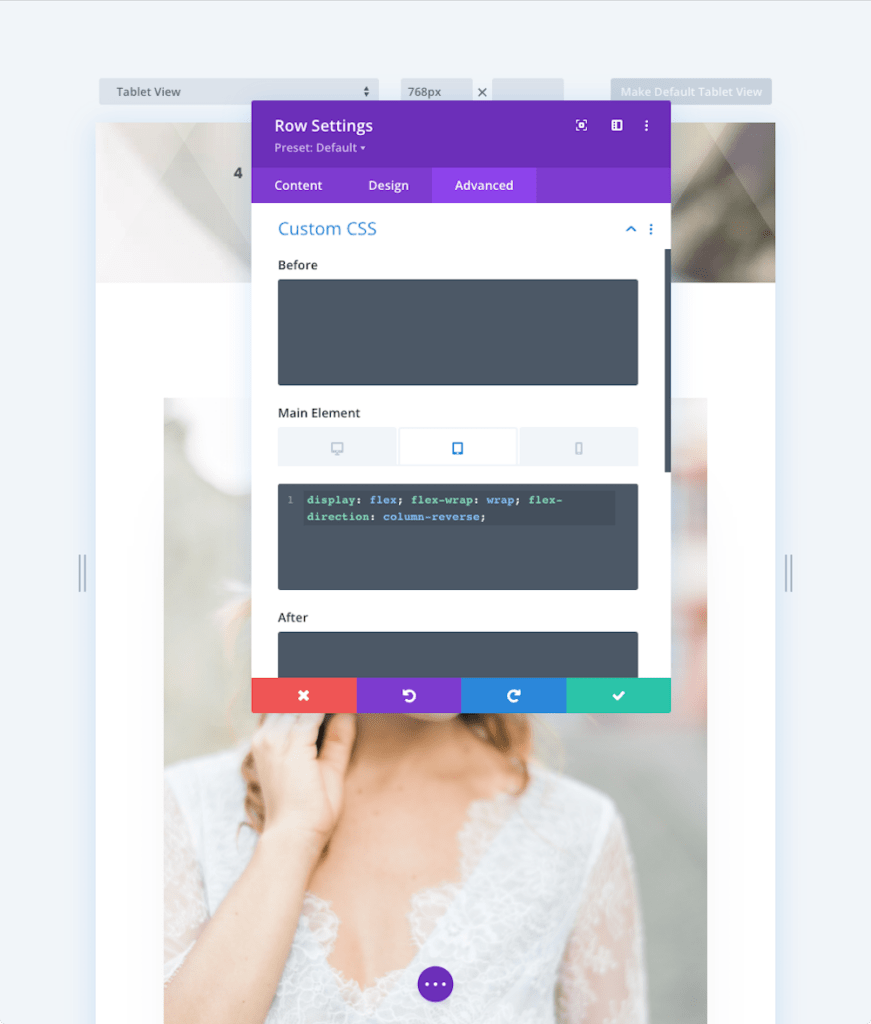
A more direct approach is to put the CSS code into the specific Divi Row Settings, Main Element CSS field.
As with the prior method, go to the Divi Row Settings, Advanced Tab then scroll down to and open the Custom CSS section.
IMPORTANT: click the Main Element display option so that you are on the Tablet View!
Now enter in the following CSS code into the Main Element field:
display: flex; flex-wrap: wrap; flex-direction: column-reverse;
That’s it! Now the columns in this row will stack in reverse order on the Mobile (and Tablet) view.
The advantage of this surgical strike method is that it targets one row with the specific CSS code.
The disadvantage is that if you are going to be doing this more than once, now or in the future, there is a greater chance of introducing and error from typos, and incorrectly setting the display view. Also, if the CSS code ever needs to be tweaked in the future, you’ll have to replicate the change in multiple locations.
For these reasons, I would suggest you simply stick to using the first method, the global method.
Divi Column Stacking Order Summary
In almost all cases, when you have a two column row with text in the left column and an image in the right column, it looks better when the columns are reverse stacked in the Mobile view. Through CSS, we can control and reverse the Divi column stacking order for mobile.
Have you had an issue with column stacking in your mobile view? How did you solve it? Let us know in the Comment section below.
Now that you have mastered Divi column stacking, check out our post on How to Create a Digital Business Card in Divi
Perfect! Thank you!