Crafting a Real-World Divi 5 Global Style Guide
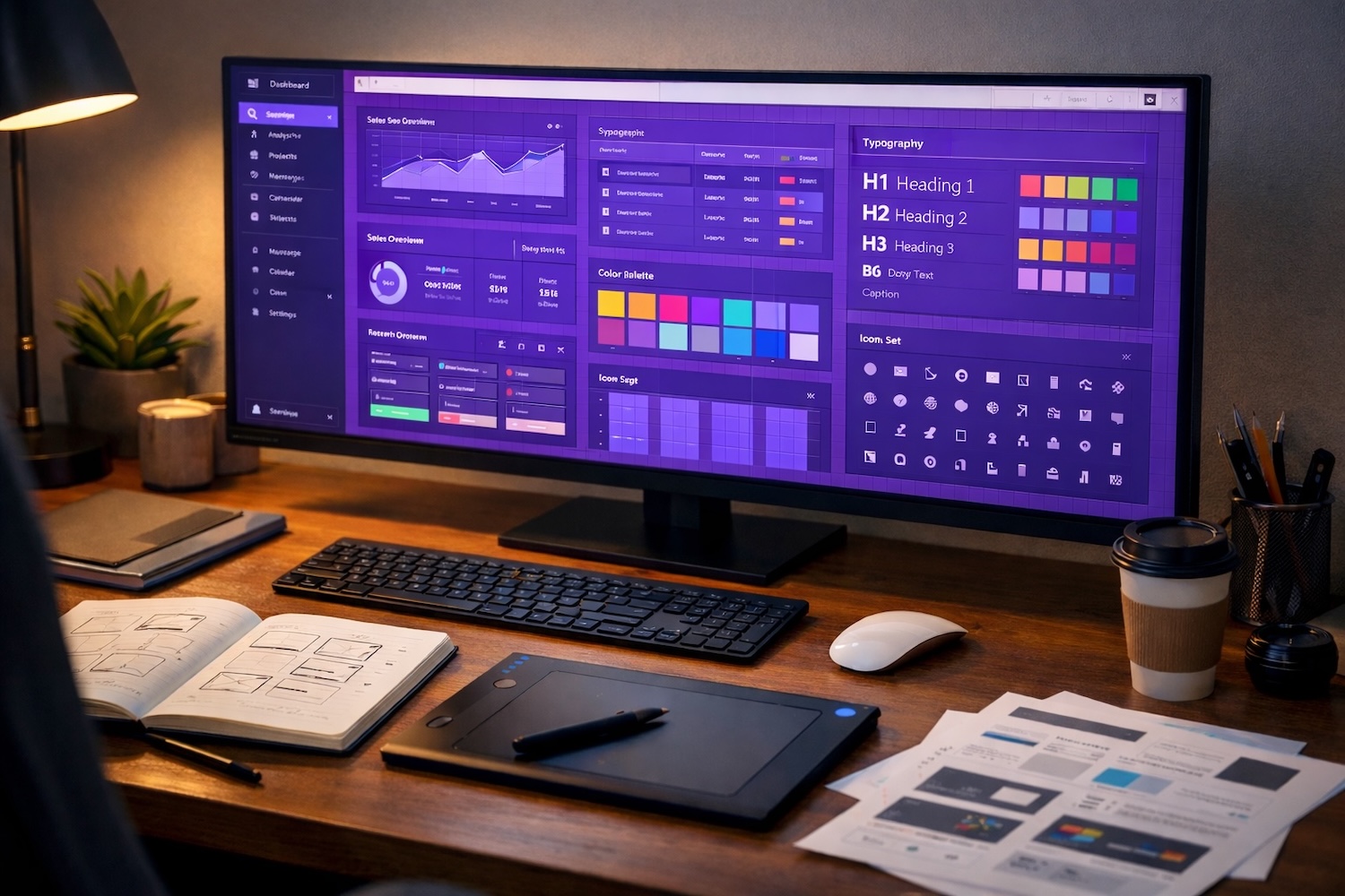
Setting up global presets and variables in Divi 5 can save hours on every project, yet most tutorials only skim the basics. This guide walks through a practical, real-world approach to building a Divi 5 global style guide you can actually use across your site.
Divi 5 introduced global variables, allowing colors, fonts, spacing, and other values to be defined once and reused across multiple modules and presets. Combined with global presets, this creates a true site-wide design system where changes made in one place automatically propagate throughout the entire website.
What is a Divi Global Style Guide?
A Divi 5 Global Style Guide is a centralized place where your site-wide design settings, variables and presets are managed. It includes elements like logos, color palettes, fonts, buttons, and module presets. Instead of adjusting styles across dozens of pages, you define them once and apply them consistently throughout the site.
This makes it easy to review your design system, keep everything visually consistent, and update styles across the entire website from one place.
Let’s walk through a real-world example.
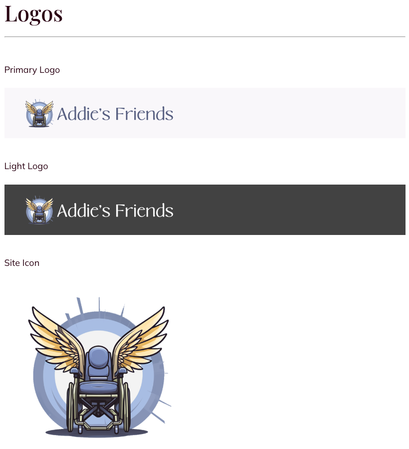
Logo Style Guide
Keep Your Logo Usage Consistent Everywhere
Logo consistency extends beyond your Divi website. The same logo assets are often needed for social media profiles, other websites, and marketing materials like flyers or business cards. Keeping everything organized in one place makes it easy to access the correct version whenever it’s needed.
Your style guide should include the primary logo along with key variants, such as a light version for dark backgrounds, a site icon for favicons and mobile icons, and any alternate formats. Depending on the brand, this may also include horizontal layouts, watermark versions, print-ready files, and simple black or white versions.
Side note: Learn how to create a free Divi digital business card

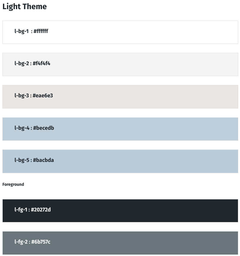
Global Colors
Define Your Brand Tone with a Color Palette
Your global color palette sets the visual tone of your entire website. It establishes the colors used throughout your layouts and helps maintain a consistent look across every page and module.
In Divi 5, these colors can be defined as global variables, allowing sections, rows, cards, buttons, and other modules to reference the same values. This ensures visual consistency across the site while allowing updates to be made once and automatically applied everywhere.
A well-structured Divi palette typically includes:
- Light Theme Colors
Background and foreground colors used for standard sections with light backgrounds and dark text. - Dark Theme Colors
Background and foreground colors used for darker sections where light text provides contrast. - Accent Colors and Hover States
Brand highlight colors used for buttons, links, and interactive elements, along with their hover variants.
Color Naming Conventions
The color variables follow a simple naming system that makes them easy to recognize and reuse across presets and modules.
The first letter identifies the theme:l = light themed = dark themeac = accent color
The middle portion identifies the usage location:bg = background colorfg = foreground color (text or icons)
The number indicates the relative usage level or variation within that group. Lower numbers are typically the most common or primary colors, while higher numbers represent alternate surfaces or secondary tones.
For example:
l-bg-1 → primary light backgroundl-bg-3 → alternate light surfacel-fg-1 → primary text colorac-1 → primary accent colorac-1h → accent hover color
This structure keeps the palette predictable and makes it easy to reference colors when building presets, sections, and modules throughout the site.
Light Theme Colors
The Light Theme defines the background and foreground colors used for standard sections of the site. These colors create the default reading environment where light surfaces are paired with darker text for clarity and contrast.
Multiple background levels (l-bg-1, l-bg-2, l-bg-3, etc.) provide subtle variations for sections, cards, and panels, while the foreground colors (l-fg-*) define the text and icon colors placed on those lighter surfaces. This allows layouts to maintain visual depth while keeping the overall interface bright and readable
.
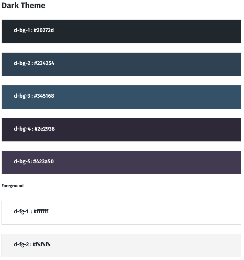
Dark Theme Colors
The Dark Theme defines the background and foreground colors used for sections designed with darker surfaces and lighter text. These colors create high contrast layouts that work well for hero sections, call-to-action blocks, feature panels, and footer areas.
Multiple background levels (d-bg-*) provide darker surfaces with subtle variation, allowing sections, cards, and containers to layer visually without becoming flat. The foreground colors (d-fg-*) define the text and icon colors placed on those darker backgrounds, ensuring readability and clear contrast throughout the layout.
Pro-Tip: There are global colors with the hover title “Heading Text Color” and “Body Text Color”. These come from the WordPress: Appearance > Customize | General Settings > Typography under those titles accordingly.
While it looks and acts like you can change those colors from the Divi UI. It won’t save them.

Global Fonts
Font Styles That Scale Across All Devices
In the Divi Global Style Guide, typography is defined using global variables and clamp-based sizing, allowing headings and body text to scale smoothly across screen sizes without creating separate desktop, tablet, and mobile settings.
Instead of maintaining multiple breakpoint values, clamp() defines a minimum size, a fluid scaling range, and a maximum size. This allows text to grow gradually with the viewport while staying within readable limits.
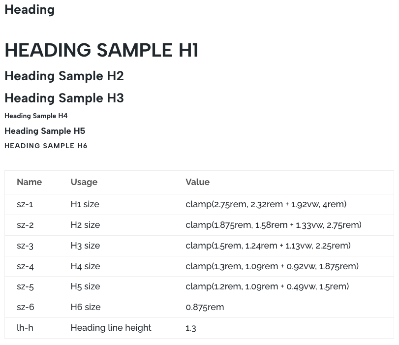
Heading Text
Heading sizes (H1–H6) are defined using clamp-based variables such as sz-1 through sz-6. Each value sets a minimum size, a responsive scaling factor, and a maximum size. This ensures headings remain visually balanced across devices while preserving a clear hierarchy.
For example:
clamp(2.75rem, 2.32rem + 1.92vw, 4rem)
This means the heading will scale fluidly between the minimum and maximum values depending on screen width.
Body Text
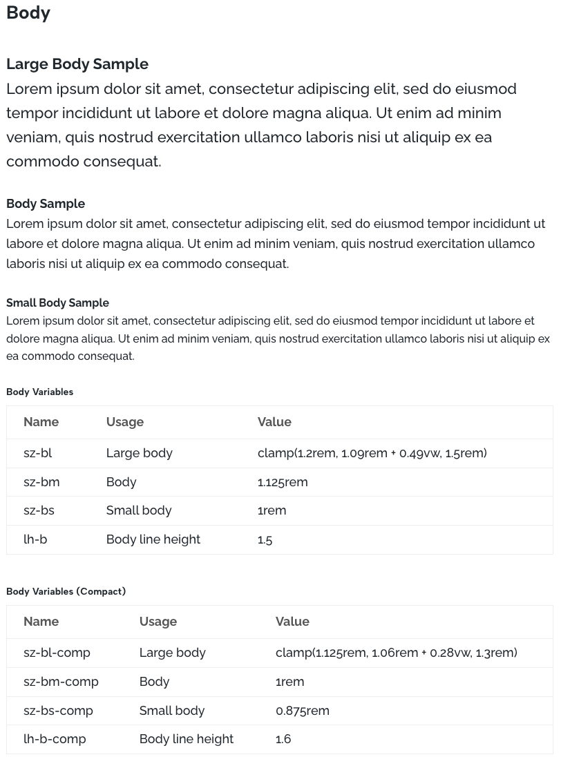
Body typography uses two size systems depending on the type of content on the page.
The default body scale is designed for marketing pages and general site content. It uses a base size (sz-bm) of 1.125rem (18px) for comfortable reading with shorter blocks of text. These sizes are defined with variables such as sz-bl, sz-bm, and sz-bs, along with the line height variable lh-b.
For longer-form content such as blog posts or documentation, a compact scale is available. This version uses slightly smaller sizes, beginning at a base size (sz-bm-comp) of 1rem (16px), allowing more text to fit comfortably on the screen while maintaining readability.
To use the compact scale, edit the Text preset (or create a new preset) and change the body variables from sz-bm to sz-bm-comp for the default paragraph size, and lh-b to lh-b-comp for the line height. This switches the page to the tighter reading scale while keeping the same typography structure.
Font Family
Use web-safe or hosted Google Fonts that load fast and are supported across devices.
In our example, with is for a simple non-text heavy website, a larger 1.13rem/18px font is appropriate compared to the default 1rem/16px.
For this site we are using heading 6 as a super-title so it is static small font. We also skip a size progression between h1 and h2 because in practical matters, h1 is typically a much larger font reserved for page headings.
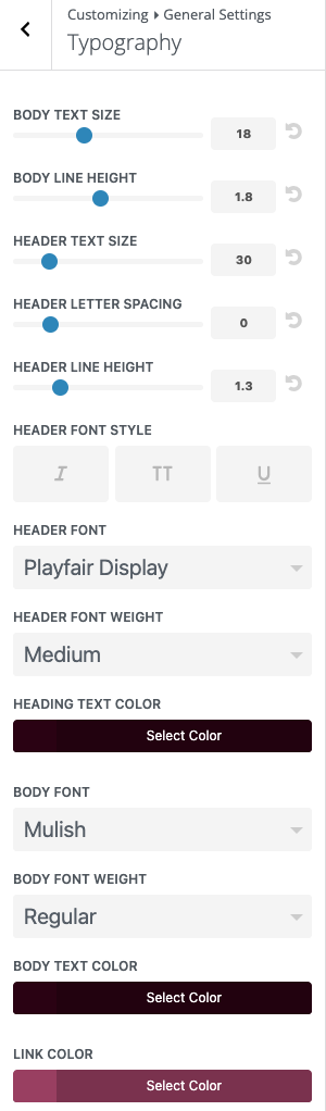
Setting WordPress Global Font
Some of the Divi global settings are configured in the WordPress menu. Specifically Appearance > Customize, then General Settings > Typography
The BODY TEXT SIZE is the default for some of the Divi modules, so set that to 18px or 16px accordingly. You should override this px value with the corresponding rem in the module presets. Same for BODY LINE HEIGHT.
Leave HEADER TEXT SIZE, HEADER LETTER SPACING, HEADER LINE HEIGHT, HEADER FONT STYLE alone as they are set in the Global Presets.
The important settings are HEADER FONT, HEADER FONT WEIGHT and BODY FONT, BODY FONT WEIGHT. These are your “default” fonts in the Divi Builder.
For Best Practices, always use default as the font setting in Divi Builder. This lets you change you font family in one spot, here, which then flows throughout the site.
A note on the color settings is that WordPress does not recognize the Divi global color palette. So you’ll have to manually copy and paste the relevant hex color codes. And also, repeat the process if the corresponding Divi global color is changed in the future.
Why We Size in rems
We use rem units for font sizes to support a flexible and accessible typography system. rem stands for “root em,” meaning values scale relative to the root font size of the page, which is typically defined by the user’s browser settings.
If a user increases their browser’s base font size for accessibility, text sized in rem will scale automatically. For example, body text designed around a 24px base could scale to around 27px when the user increases their default font size, improving readability without requiring browser zoom.
Unlike fixed pixel values, rem-based sizing allows typography to adapt to user preferences while keeping layouts stable. Images, spacing, and structural elements remain unaffected, ensuring the page maintains its intended design while still respecting accessibility settings..

Why We Use em for Component Sizing
Values like button height, line height, letter spacing, and certain spacing are set in em so they scale relative to the element’s current font size. This keeps components visually balanced as typography changes.
For example, if a button’s text size increases, using em allows the button height, padding, and letter spacing to scale proportionally with the text. Without em, you would need to manually adjust these values for each font size variation, making the system harder to maintain and less consistent.

Global Buttons and Others
Locking In Your Global Button Styles
Buttons are one of the most frequently used elements on a website, so defining them as a global preset in your Divi Style Guide ensures consistent calls-to-action across the entire site.
Set the button typography, colors, padding, border radius, and hover states once, then reuse that preset anywhere a button appears. This keeps buttons visually consistent and allows design updates to be made in a single place rather than editing individual modules.
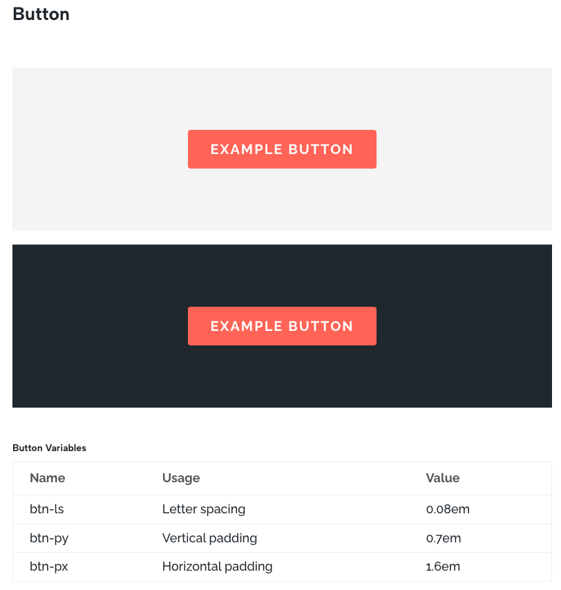
Button Variables
Button sizing is controlled with a small set of variables so the button stays visually balanced regardless of text length or font size.
btn-ls Letter spacing. Controls the spacing between characters in the button label. A slight increase improves readability, especially when using uppercase call to action text.
btn-py Vertical padding. Defines the top and bottom padding of the button. Because this value uses em, it scales with the button’s font size and keeps the button height proportional to the text.
btn-px Horizontal padding. Defines the left and right padding, controlling the width and breathing room around the button label while maintaining consistent proportions as the text scales.
Together these variables keep buttons consistent in shape, spacing, and visual weight across the site while still adapting naturally to typography changes.
Updating Row Widths for Modern Screens
Divi’s default max width of 1080px feels tight on today’s displays. Setting your row max width to 1600px gives your layout more breathing room and looks better on large monitors. It’s a simple global adjustment that instantly makes your design feel more current and balanced. Typically I just change the default preset for rows to apply site-wide.
Using Compound Modules Like Blurbs and CTAs
Modules like Blurbs, Calls to Action, and Person Modules can be handy, but they come with more moving parts. If your design calls for them, remember to create a clean preset to keep styles consistent. Just add them to your Divi Global Style guide.

Divi Style Guide Installation
Installing the Divi Global Style Guide on Your Site
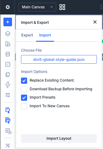
Okay, so you made it this far and you’re ready to put this into action — excellent. Installing your Divi global style guide is as simple as importing a json layout file to get it started. From there, you can start customizing the global presets to your site’s needs. Then you can either apply the changes page by page to your site.
Here is the Divi json file containing the example Divi global style guide settings shown above:
divi5-global-style-guide.json- Right-click, save link as > Download json file.
- Pages > Add Page : Use Divi Builder, close “Create Your Page” box.
- Top Left Corner, Gear Icon > Import
- Select the downloaded file
- check “Replace Existing Content”
- click “Import Presets”
A Practical Divi 5 Global Style Guide
Creating a real world style guide in Divi requires a bit of upfront setup, but it quickly improves the entire workflow. By defining logos, color variables, typography, buttons, and core module styles as global presets, the design system becomes predictable and easy to manage.
With these foundations in place, pages can be built faster while maintaining a consistent visual language across the entire site. Updates also become simple since changes to variables or presets propagate everywhere they are used.
If you want additional information, refer to Elegant Themes Divi 5 Help